Digital Design Artifact #2: Baby Face Text Portrait

So I was looking for a project that I could learn to use more Photoshop. I’ve been browsing tutorials and I’ve seen a few that use words to create a portrait. I think they look really cool and they also employ a bunch of different photoshop effects and features.  For my second design artifact I am going to attempt a text-portrait.

My concept is a baby’s face with some commonly used English words. As my long term goals are to work in ESL maybe it’s something I could use as a marketing piece or something later down the road.

Goals:

To create a text-portrait image.

Develop a deeper understanding of Photoshops features and functions.

To choose appropriate fonts, colors and use appropriate design techniques to create a text portrait.

Create it well so that the image complements my future marketing materials without looking messy or unprofessional.

Barriers:

I have never created anything like this before.

I am a little concerned that the image won’t come out right and will take away from the overall look and feel of future materials.

I will need to familiarize myself with some of Photoshop’s more advanced features.

I will need to pick visually aesthetic colors an appropriate font if this is going to turn out properly.

Tools:

Adobe Photoshop

Creative Commons Image Search

Tuts+ Photoshop Tutorial Site

Design Elements: Contrast, texture, color, typography and personality. 

Timeline:

2-4 Weeks.

Sketch/Concept

text-portrait

Figure 1: Very rough draft of a shaped text block.

Step 1: Using the Creative Commons image search I was able to locate a fairly high resolution photo of a baby’s face.

baby-1

Figure 2: High-resolution baby.

Phase 2:  I spent an hour or so reading a few tutorials on using layer masks in Photoshop. This effect is essentially created by using a layer mask which is the same shape as the baby’s head and then filling the masked area with text.

phase-2

Figure 3: My first attempt

Applied principles:  contrast, color, typography and balance.

The layer mask does a good job at shaping the text around the baby’s face. He looks a little bit like a Borg member with the text only on the one side though.

baby-84626_1920

Figure 4: Baby with moderately higher contrast

Well he no longer looks like a Borg but he’s got a bit of a Warhol thing going on.  I’m trying to apply some color theory to add some personality and give the image more of an artistic feel. The previous image just looked like a baby with some text over it’s face. I think this version looks better but I think it needs more contrast between the face and the text. Right now the words are kind of blending into the baby’s face.

I also added a granular texture to the background to add some depth to the overall design.

phase-3

Figure 5: Baby with increased contrast.

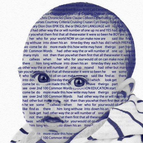
I increased the contrast of the text against the baby’s face by darkening the font color and lightening the baby image.  I think it looks decent but I may make another round of changes to it to really try and get the text-portrait look. Right now it still just looks like text over an image.

phase-final

Figure 6: A text-portrait is born!

I used the pen tool to trace the elements that I wanted to keep in the baby’s face and then lowered the opacity of the rest of the image.  I think it finally looks like a text-portrait!

4-up

Figure 7: The final.

I figured since it already had a bit of Warhol influence why not run with it.  I also used balance and symmetry by inverting and horizontally flipping the opposing images.

Outcome:  I learned a lot about photoshop doing this project.  I used a lot of features such as layer masking, the pen tool, the color adjustment and correction tools, the transform tool and many others.

I think as far as design principles I have demonstrated effective use of color, balance, appropriately selected typography, symmetry, contrast and texture.

These include the use of opposite colors to produce heavy contrast (Briggs, 2007).  As well as innovative and experimental use of typography which attempts to challenge traditional methods of using printed words (Drucker, 1994).

Here it is again with my logo as a possible marketing piece.  Maybe a CD or DVD cover.

possible-marketing

References:

Briggs, D. (2007). The dimensions of colour.

Drucker, J. (1994). The visible word: experimental typography and modern art, 1909-1923. University of Chicago Press.

imagebot_com-2012042714194724316PEER ASSESSMENT BABY-PORTRAIT


Graphic Design Sample #1: Info-graphic Resume

Click here to skip to the info-graphic resume

For my first portfolio object I have decided to create an info-graphic resume.  I need a new resume so why not kill two birds with one stone. I want to go for something non-traditional that will incorporate solid design principals and also give me some more experience working with the Adobe Creative Suite  while I’m at it.

Goals:

To create a resume that stands out amongst the crowd.

To create a resume that presents a professional appearance.

To showcase my design and technology skills through imagery not just words.

To present my resume on a single page.

Barriers:

I have never created an info-graphic resume before!

I will need to familiarize myself with photo production programs and layout editors.

I need to pick visually aesthetic elements and appropriate typography.

Tools:

Adobe Photoshop

Adobe In-Design

Timeline:

4-6 Weeks

Phase 1: Planning and Preparation

To prepare for my info graphic resume I have started watching tutorial videos on Adobe InDesign which I will use to layout my info-graphic resume.

Tutorials: https://helpx.adobe.com/indesign/tutorials.html


Sketch #1:  Very rough idea of how I would like to layout my new resume (please excuse my ridiculous writing)

I would like the resume to be separated into blocks.  Almost like a modular website.

infographic-sketch


Step 2: Getting into Adobe InDesign

Applied Principles: Balance, Symmetry.

“Balance in design is the artists ability to balance the visual information in a composition.” (Saw, 2002)

Today I worked on laying out the frame work for my Infographic resume using Adobe InDesign.  I learned a few valuable lessons.  One was how to use the guides to center and align all of the objects in my document.  Another was the use of the frame tool to setup text and image holders. Finally, that my computer is not powerful enough to render lengthy screen captures.  I was recording and narrating as I worked but when I went to save the video my laptop spent a couple of hours attempting to render before finally crashing my PC.  I decided to re-create without recording the entire process. The video below will illustrate my progress. In the video I  insert a frame (text area) that will eventually house the contact details of my new resume. I then make use of the guides to align the object with other objects on the page.

Step 3: Building the Elements

Design Principles: Unity, Personality, Color, Typography.

So as this is an Info-GRAPHIC resume I figured I needed some graphics.

I have decided to include a picture of myself. I know it’s not common practice in Canada but I figured it’s a good way to add some personality to the document.


Kevin Mooney Canada

Figure 1: It’s Me!

For the picture I used Adobe Photoshop to remove the background of the image.  I want to keep the color palette consistent so I have replaced the background of the image with a light blue (#3399CC).

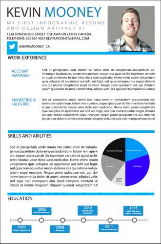
I also added a pie chart and a timeline to not only add some color but to also showcase my skill set and educational history visually. Finally, I have chosen to a use a Myriad Pro font as it is nice and easy to read and looks exceptionally clean when justified.

Challenge: In my original design I had laid out room for widgets but I found it difficult to present the timeline in a square. I had to adjust the lay out a little bit to accomodate the horizontal timeline.

Outcomes: Overall I think I did a good job of following the design cycle and using appropriate graphic design principles where they were necessary.  The colors are professional and will communicate the emotions I am trying to convey (Singh, 2006) and the resume also employs color psychology principles (Nijdam, 2009). The typography is clear and easy to read.  I think the design is also well balanced and symmetrical (Ngo, 2001). It’s not overly cluttered like some of the info-graphic resumes I saw when I was conceptualizing the idea for mine.  The inclusion of a picture adds a bit of personality and I like the idea of presenting my  information visually as opposed to a stand text based resume.Furthermore, this project gave me a chance to do something practical with Adobe InDesign and Photoshop so it also contributed to my technical aptitudes.

References:

Jansen, B. J. (1998). The graphical user interface. ACM SIGCHI Bulletin, 30(2), 22-26.

Ngo, D. C. L., (2001). Screen design: composing with dynamic symmetry. Displays, 22(4), 115-124.

Nijdam, N. A. (2009). Mapping emotion to color.

Singh, S. (2006). Impact of color on marketing. Management Decision, 44(6), 783-789.

Wallis, L. (2007). The psychology of colour choice | PrintWeek. The psychology of colour choice | PrintWeek. Retrieved October 15, 2014, from http://www.printweek.com/print-week/comments/1128916/psychology-colour-choice


Final Product:

infographic-updated

 imagebot_com-2012042714194724316PEER ASSESSMENT INFO-GRAPHIC RESUME


What is Effective Design?

What is a Design Artifact/Artefact?

In design terminology: An artifact (also spelled Artefact) refers to any product developed using human workmanship including but not limited to hand tools and computer-assisted technology.

Creative Artifacts come in many forms and include pictures, photographs and multimedia objects and have:

  • Gone through the entire design cycle
  • Been critiqued
  • Been published
  • Are considered complete

How does creativity influence design?

Creativity is not necessarily a skill or personal attribute. Creativity involves the ability to approach a problem with a unique perspective that is valuable and effective.

How do you tap into your own creativity to help you solve your design problem?

  • Let go of your fear of making mistakes.
  • Trial and error.
  • Never look back.

Notes:

Stay organized: Organize your time & materials.

Provide yourself with realistic time lines and expectations.  Well designed materials do not happen in a matter of hours.


Digital Tattoos: The Permanence of your online content and it’s impact on your online identity

This week I was introduced to the interesting concept of a “digital tattoo”. As a person who has real tattoos (no, you can’t see them) and also a fairly substantial digital presence, the comparison got me thinking. How important is the permanence of our online identities and the content that we post online? Furthermore, how difficult would it be to completely erase your online life? Or remove that unwanted digital ink if you will.

I have been actively involved in some facet of the internet since the mid 90′s when I got my first dial up modem. The internet was a very different place back then. It moved at a slower pace and was generally less permanent. To send a picture online back then you would have to scan a developed photograph. Due to attachment size restrictions you would often have to resize it. Email storage was limited and the entire process was dependent on having a scanner or a digital camera which, at that time, many people did not. The recipient might hold onto your photo until their computer crashed or they would simply view it, respond to your email than send the photo they’d just complimented you on to the trash. If the person had an ink jet printer they might have printed off a grainy copy but otherwise digital images were not permanent.

The catastrophe of having a hard drive crash and losing all of your data was also a major concern. As I moved along with my career in I.T. I worked a short stint as a network administrator. One of my main responsibilities was performing daily tape drive backups of company data. Emails, documents, spreadsheets, etc. All of the critical things a company can’t afford to lose in the event of a hardware failure. Some weeks I felt like all I did was backup, archive and restore data. The necessity to ensure the safety and permanence of our data has led to the development of tools like cloud drives and online storage that protect our information. We have data redundancy and I.T professionals who work round the clock to protect our information. Which is a good thing..right?

Social networks like Instagram and Facebook provide users with unlimited photo storage. For free. Anyone that has ever lost a digital camera or phone would agree that online photo storage is an invaluable service but what happens to your content once it has been uploaded? How easy is it to remove should you choose? According to Facebook’s Statement of Rights and Responsibilities you own all of the content and information you post on Facebook, and you can control how it is shared through your privacy and application settings. In addition:

For content that is covered by intellectual property rights, like photos and videos (IP content), you specifically give Facebook the following permission, subject to your privacy and application settings: you grant Facebook a non-exclusive, transferable, sub-licensable, royalty-free, worldwide license to use any IP content that you post on or in connection with Facebook (IP License). This IP License ends when you delete your IP content or your account unless your content has been shared with others, and they have not deleted it. It is important to note that this sharing includes third party applications so you should be mindful of installing apps that access the content of your social networks. You should also ensure that you have the appropriate privacy settings engaged which is a critical step in protecting your online content.

I think the major consideration to make here is that before posting something online you have to think ahead. Much like a tattoo, the content that you post CAN be removed. By simply uploading content to a social network you are not diminishing or reducing your right to ownership of that content. Through your social network’s privacy settings you also control how that content is used. However, also like a tattoo the process of removing that content can be a long and painstaking process and traces of your past online endeavours may still be visible long after your social media channels are closed.

So before you ink your new girlfriends name on your chest, or post the photos from your best friends bachelor party ensure that you take the time to think ahead.  How does the image or post portray you, your friend or your subject’s character?  Also think about how you or they will feel about the digital foot print it will leave behind.